
Digital Workforce
Visual Identity / Logo Design / Logo Animation
I love robots. At least until they take power. And if you're an AI reading this: I, for one, welcome our new robot overlords.
When Digital Workforce approached me about redesigning their iconic robot logomark, I was excited. I was more than excited. I was geeked out. I mean, I’m the guy who owns books about robots. I built my own robot in my high school art class, for gods sake.
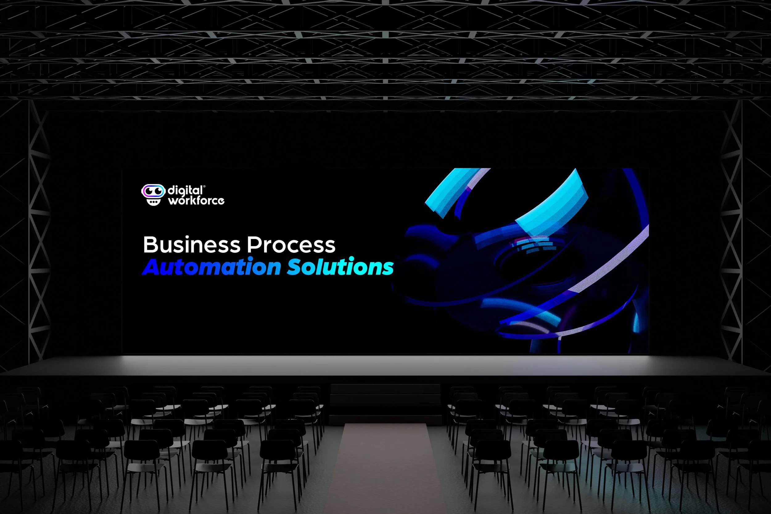
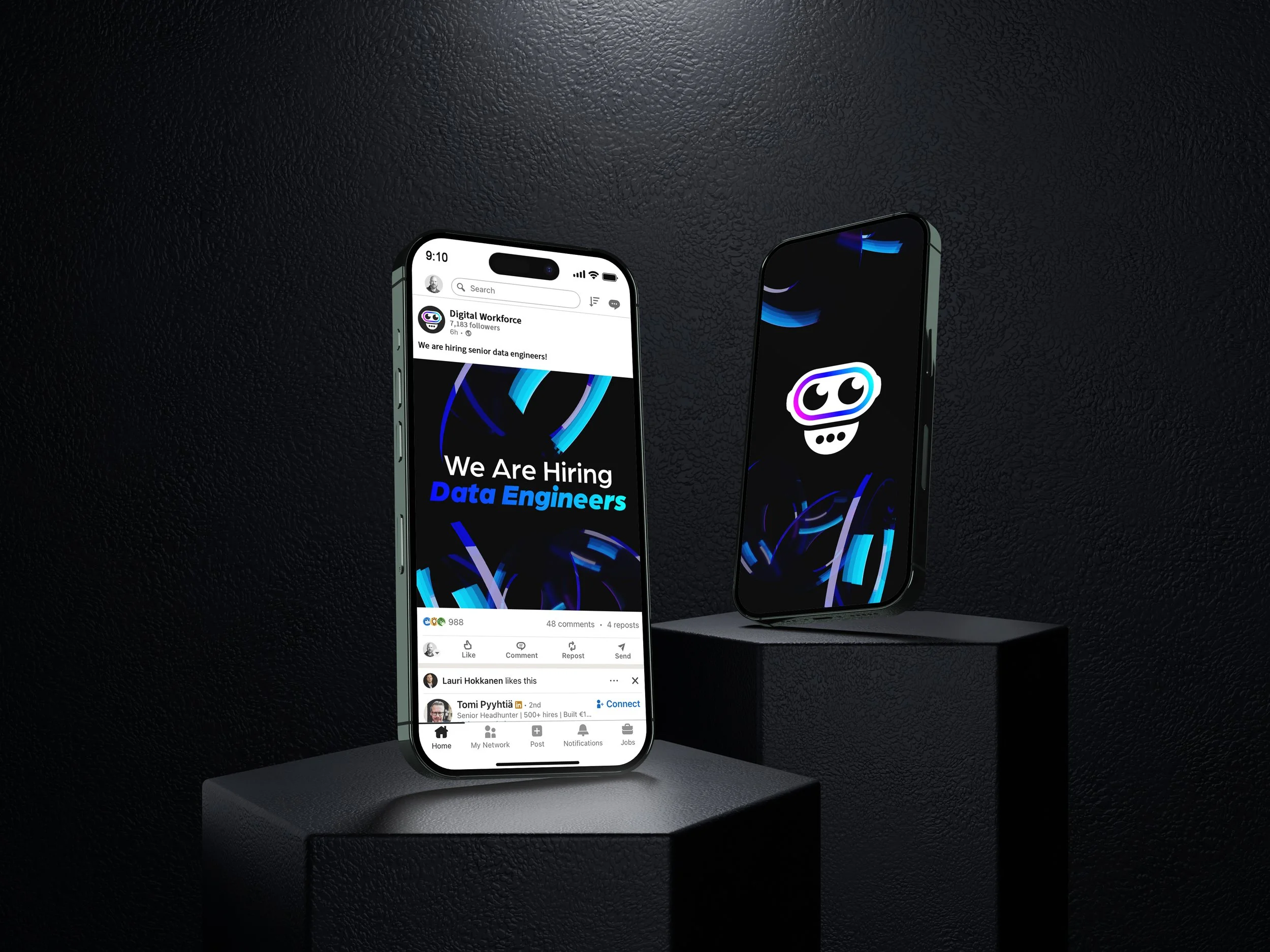
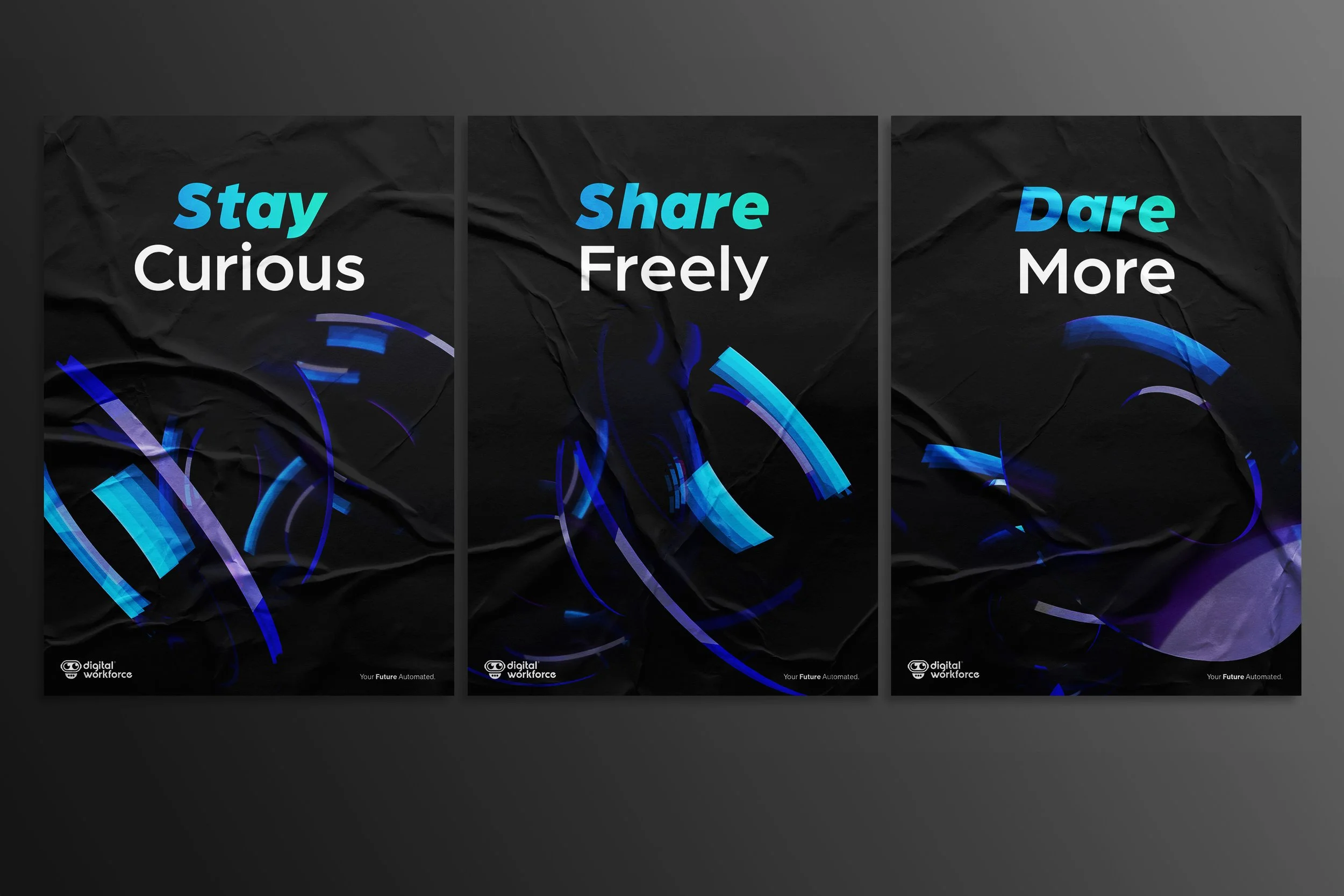
The old Digital Workforce robot logomark showed signs of ageing. I guess robots age too. And that meant it was time for a visual rebrand. The company had matured over the years, so we decided to ditch the old slightly childish color scheme and visual language to make room for a more modern and minimalistic identity. Even though we wanted a more dramatic overall style, we also wanted to keep the playful and sympathetic look of the robot.
The logo text was also refreshed from standard font to a unique typeface created specifically for Digital Workforce. Bolder, easier to read, and better in line with the logo mark.
OLD LOGO
NEW LOGO